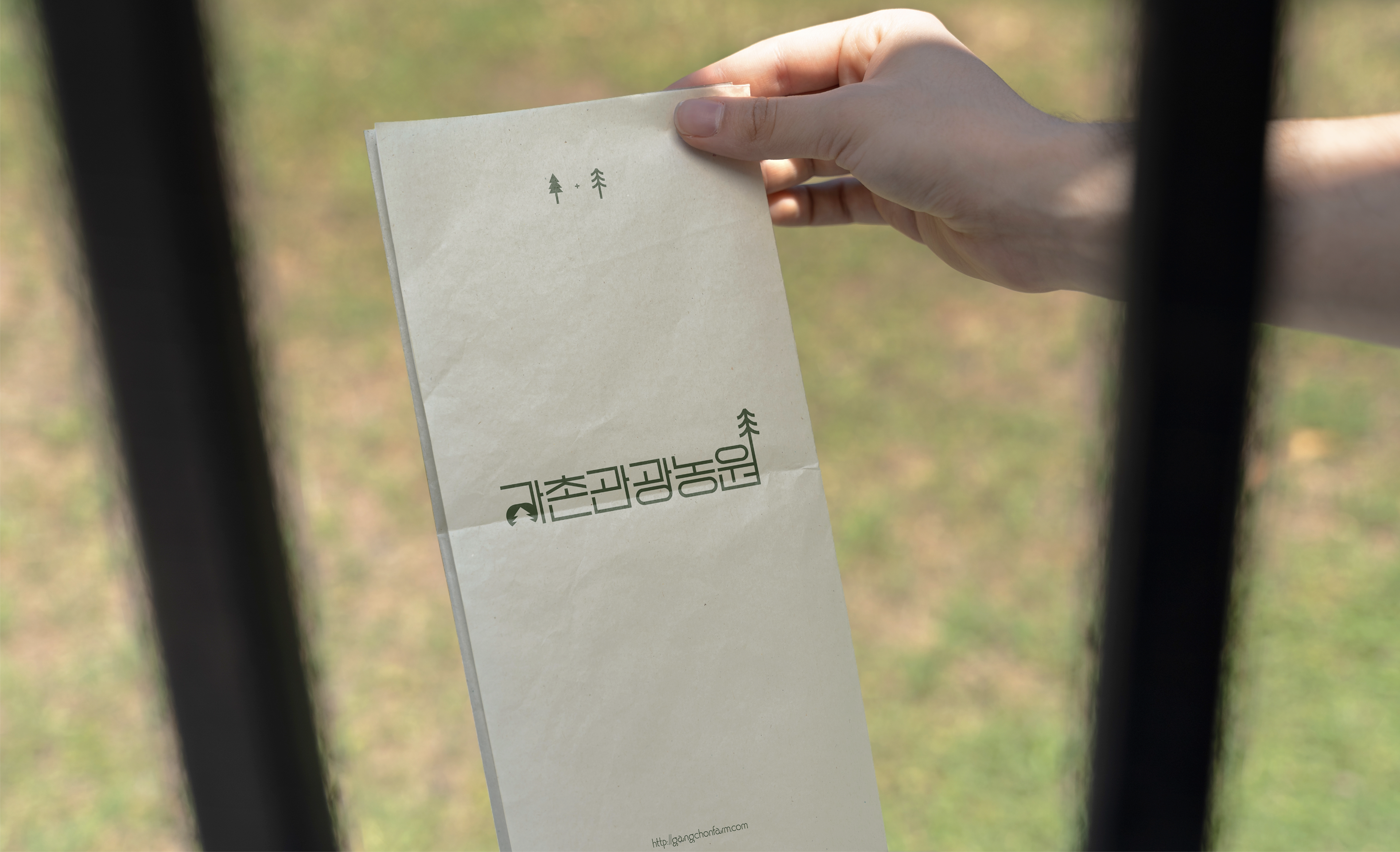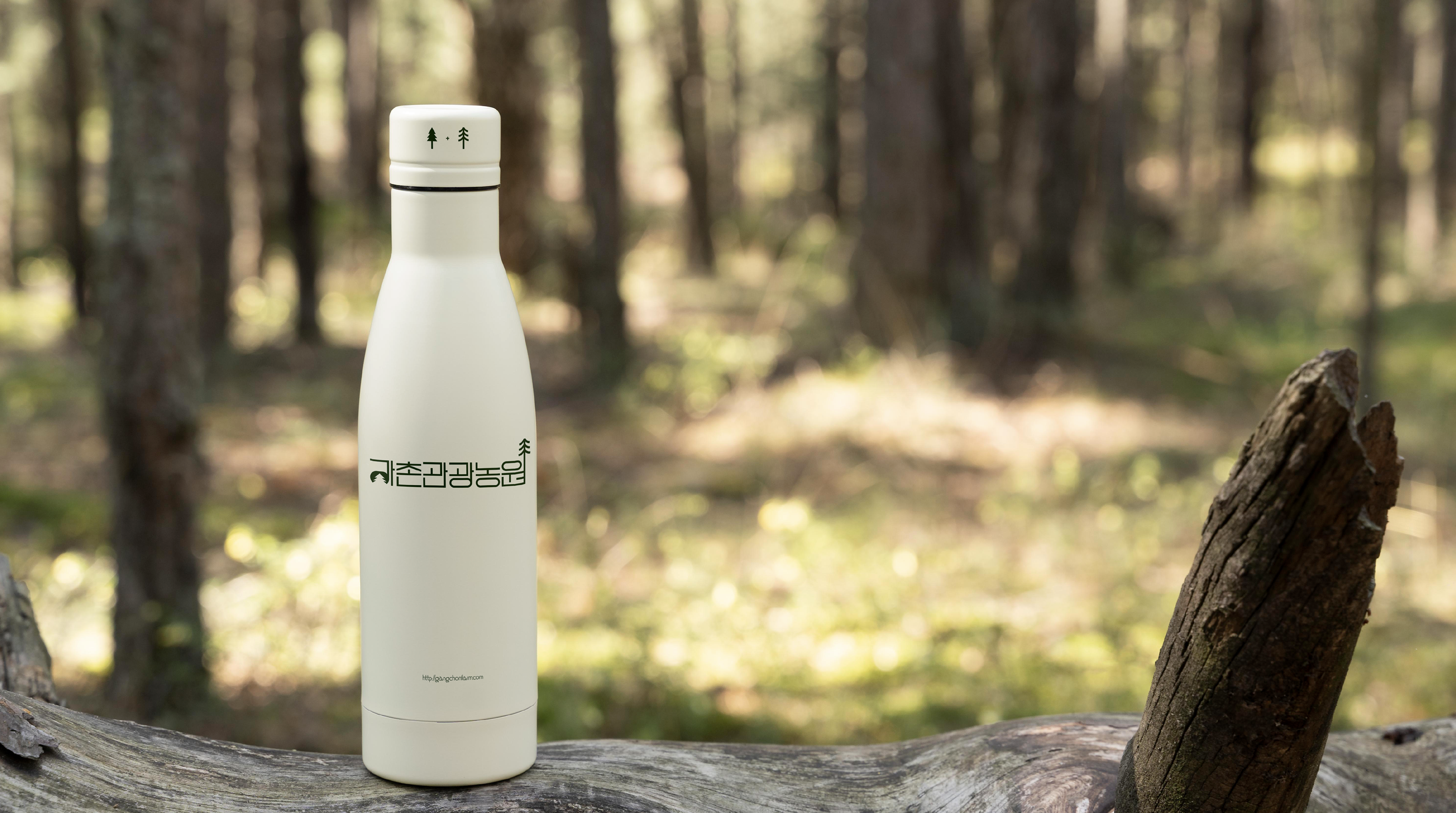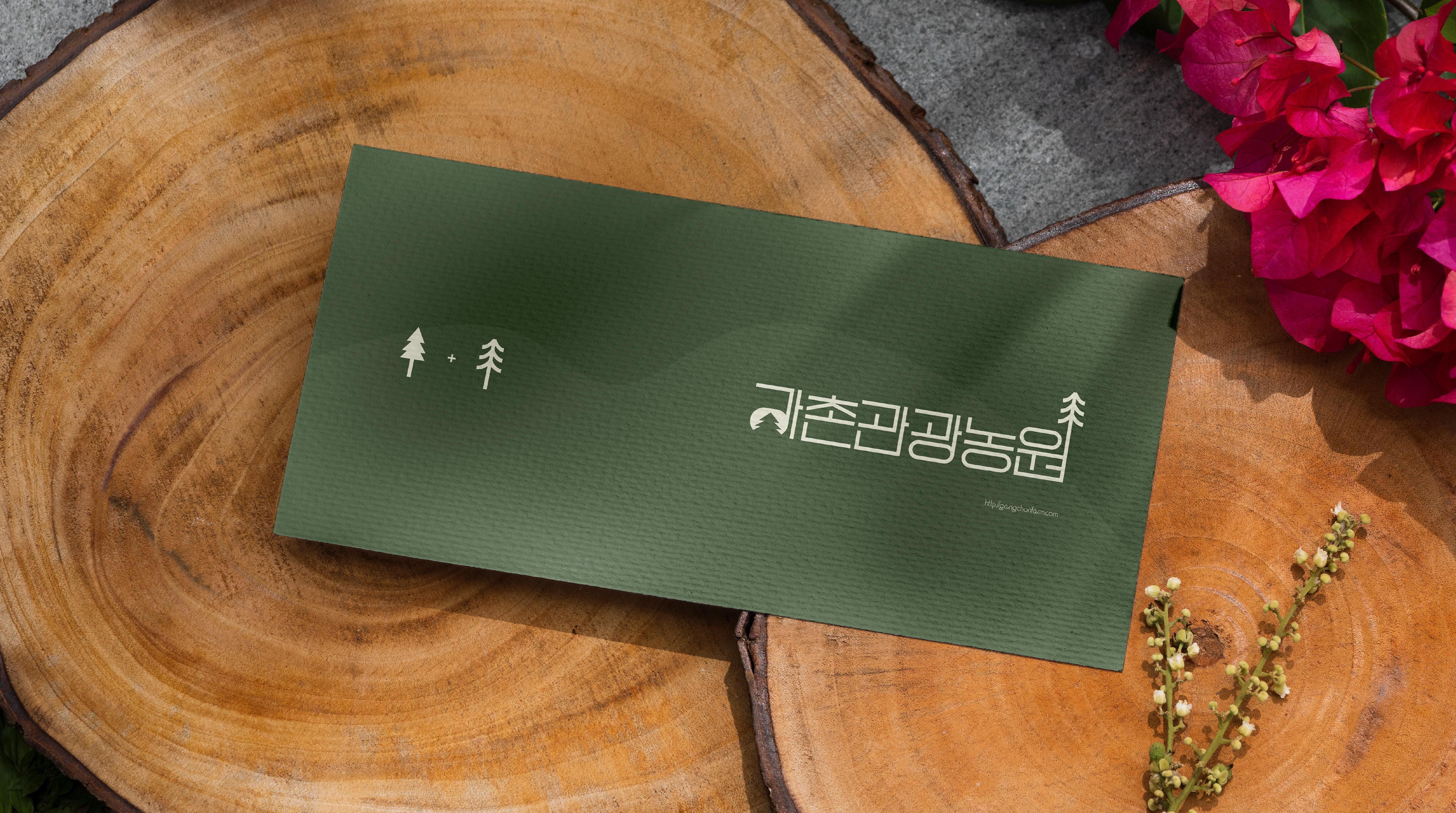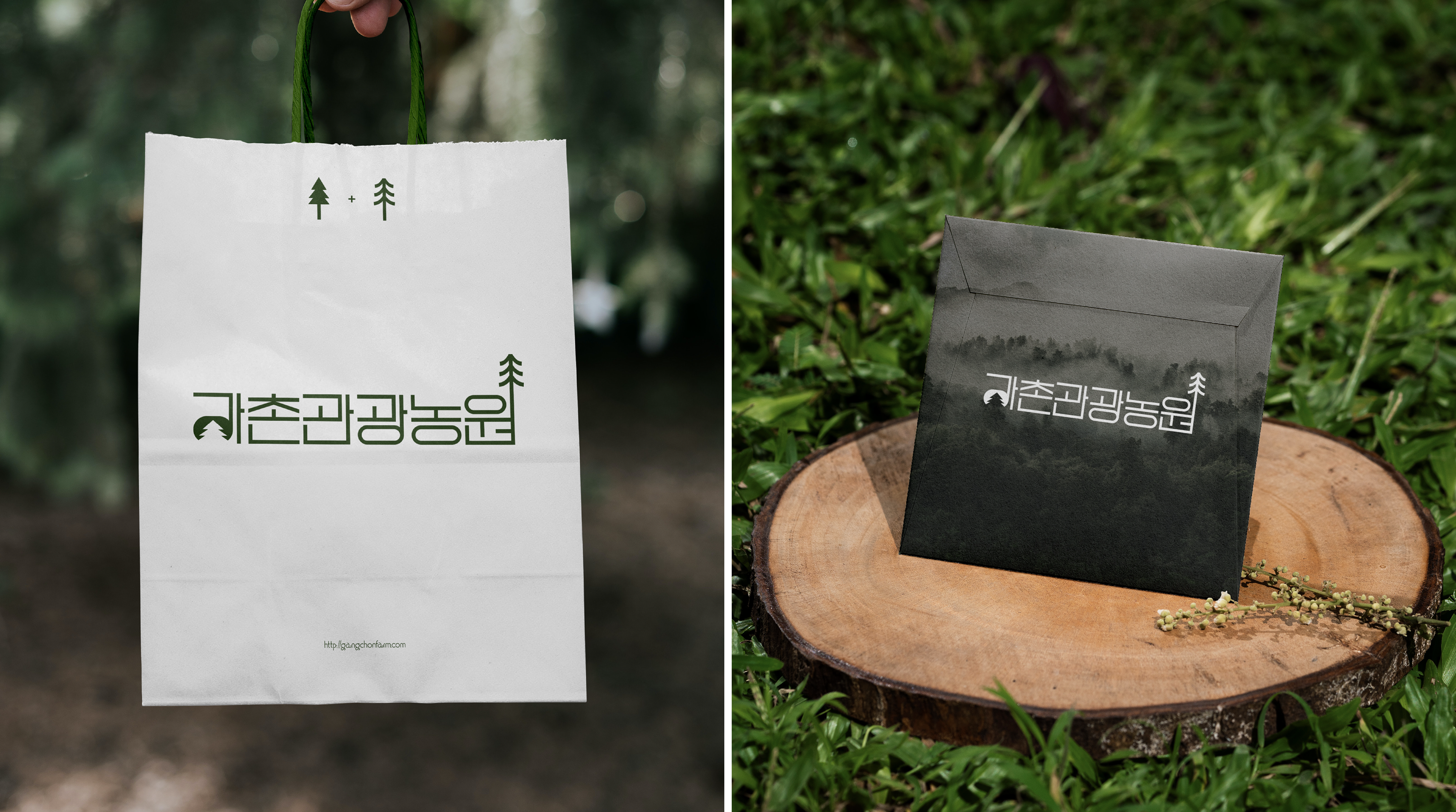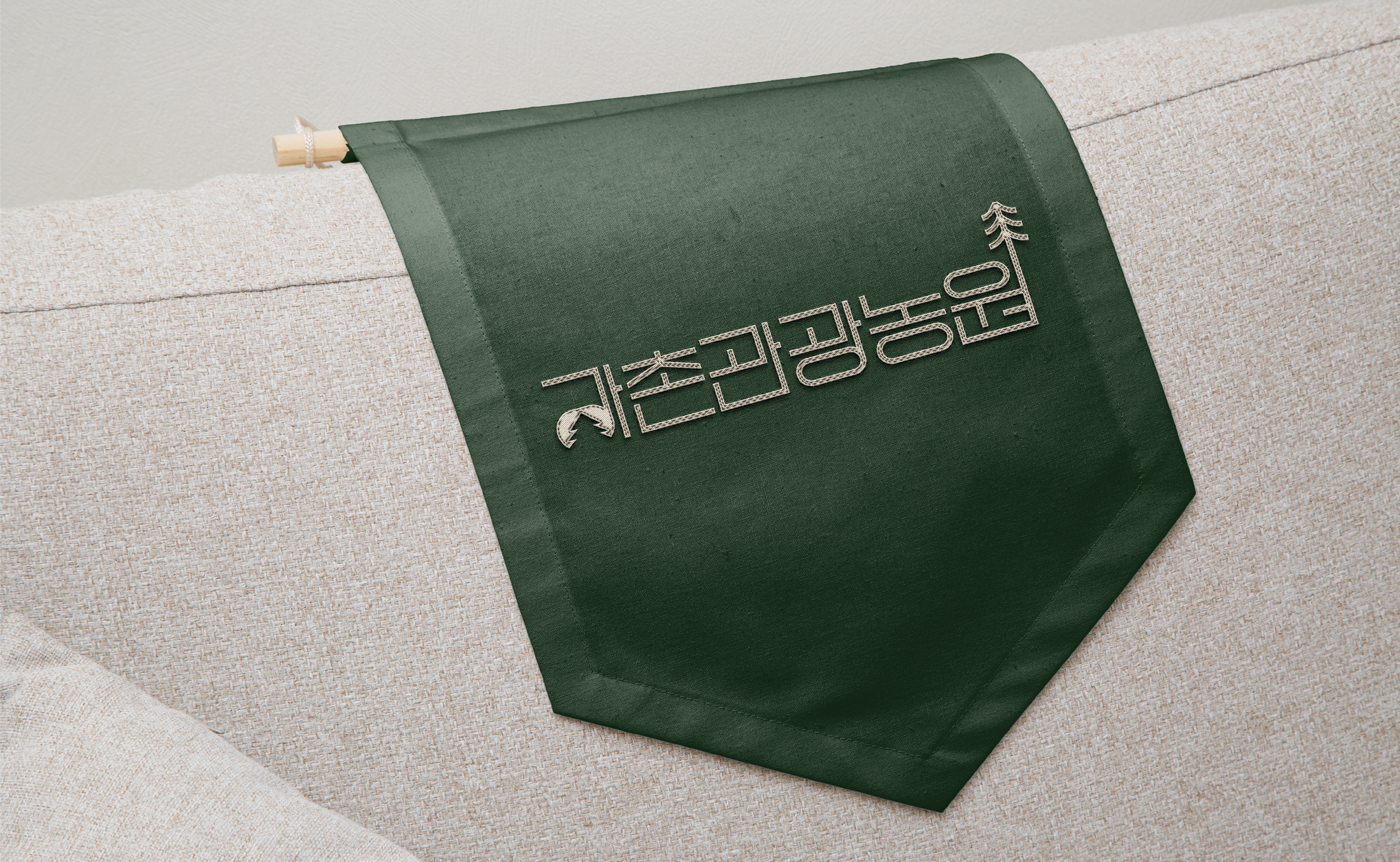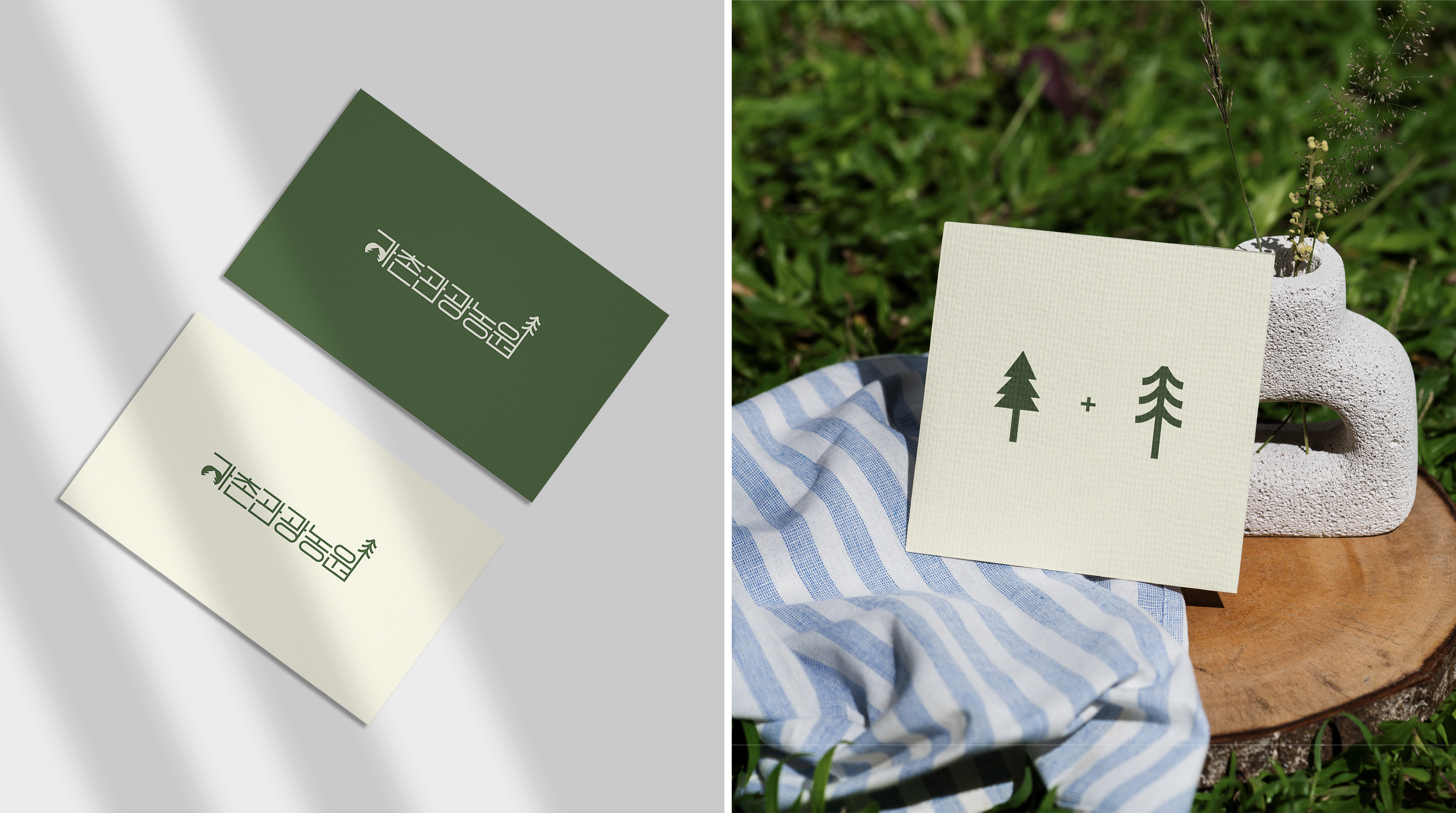
The tree-inspired symbol in the logo embodies the harmony between the forest and the camping site.
The blend of straight and curved lines conveys a sense of balance, stability, and trust,
reflecting the essence of Gangchon Farm. The green tones in the logo represent freshness and vitality,
while the soft ivory hues create a warm and inviting atmosphere, making visitors feel connected to nature.
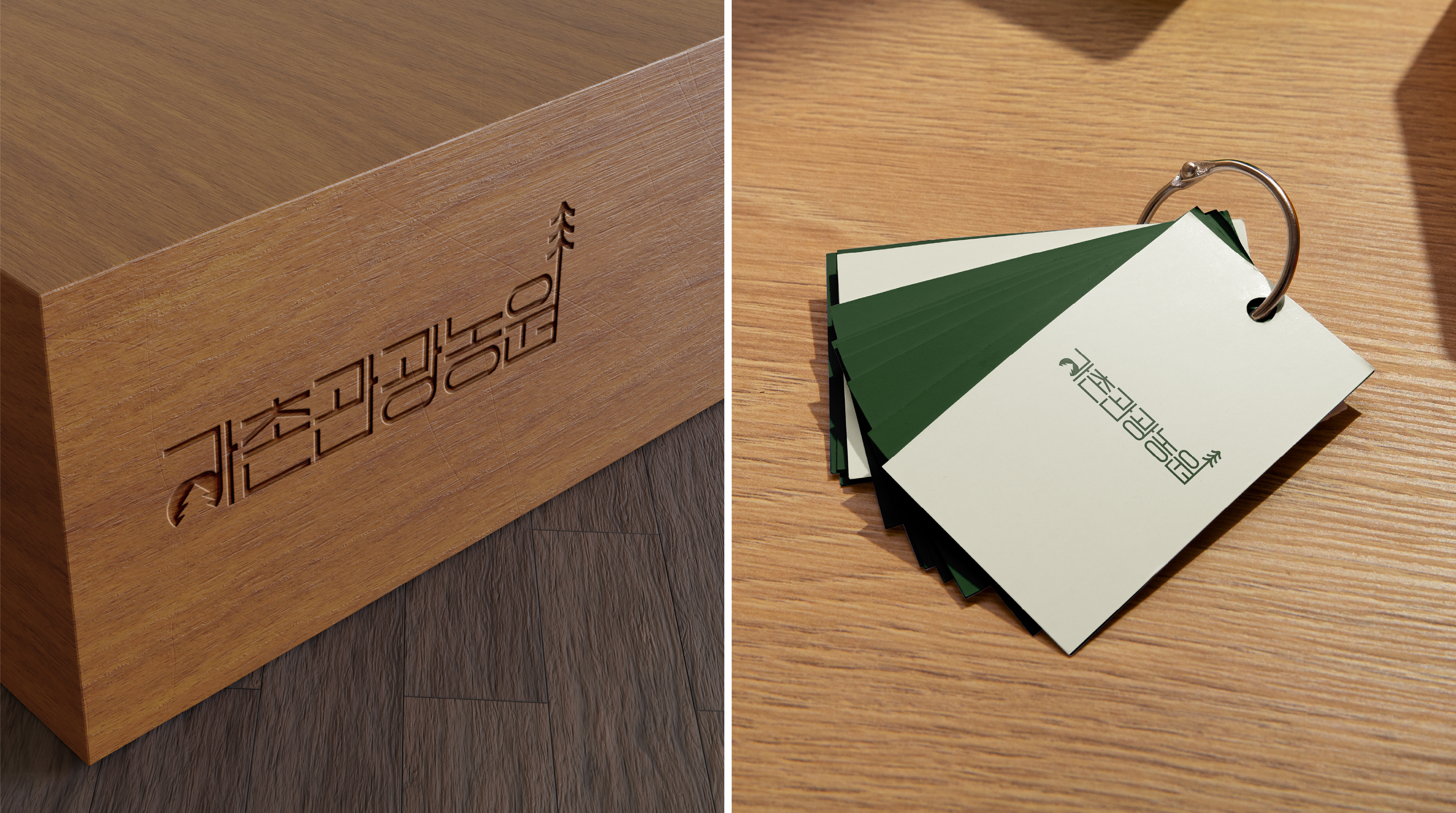
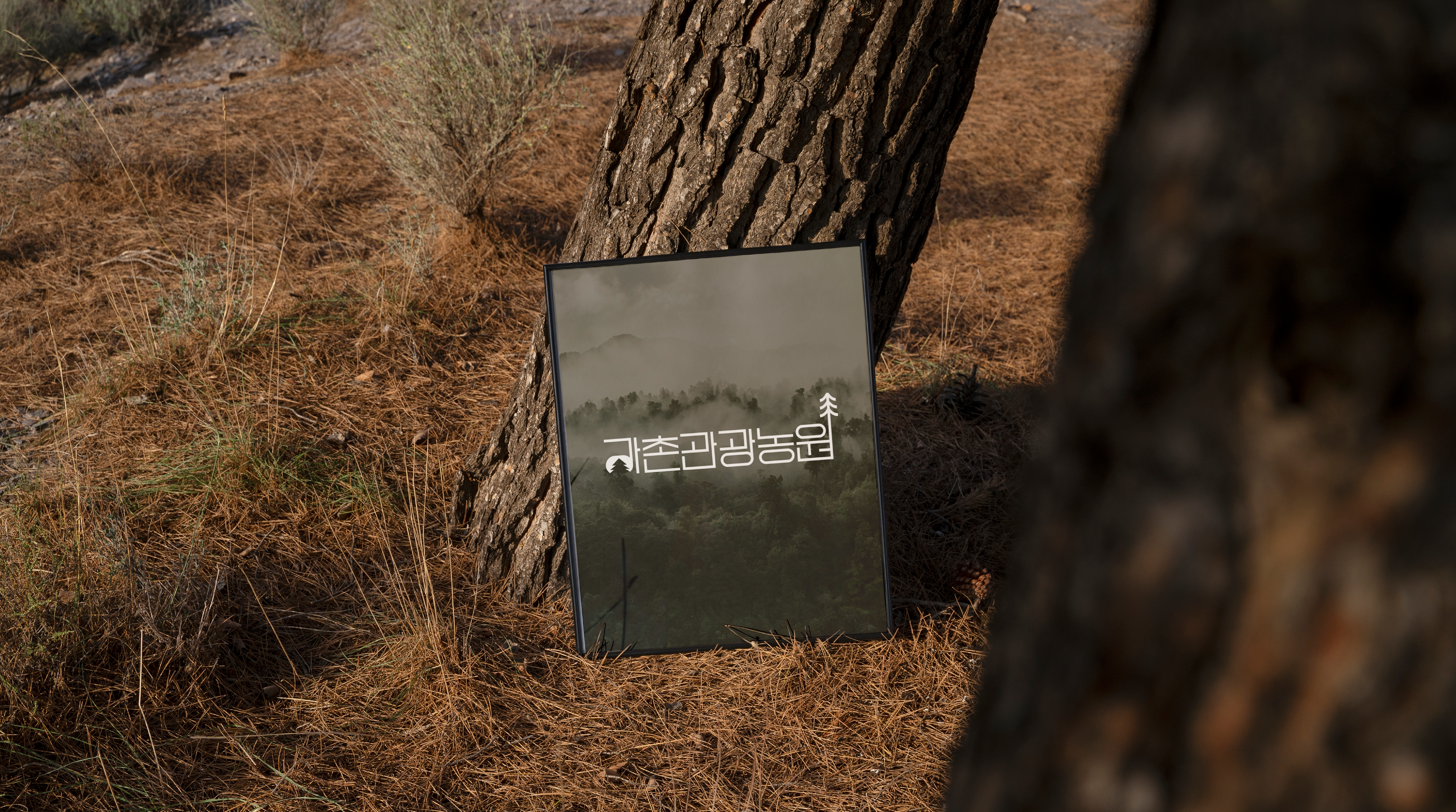
Gangchon Farm is not just a retreat—it’s a destination designed to nurture a deep connection with nature,
offering unforgettable experiences and cherished memories. With a focus on true relaxation and harmony,
Gangchon Farm brings together the tranquility of nature and the comfort of home.
로고 속 나무를 모티브로 한 심볼은 숲과 캠핑장의 조화를 나타내며, 직선과 곡선의 배치는 안정감과 신뢰감을 전달합니다.
로고에 사용된 초록색은 싱그러움과 활력을, 부드러운 아이보리 색상은 방문객들에게 편안함과 친근함을 느낄 수 있도록 합니다.
강촌관광농원은 단순한 휴식처를 넘어, 자연과 함께하는 특별한 경험을 제공하는 장소로서 자리 잡고 있습니다.
또한 진정한 힐링을 경험하며 소중한 추억을 쌓을 수 있는 브랜드로 자리 잡고자 합니다.